Introduction
In large institutions, homepages often carry symbolic weight—seen as the “front door” to everything an organization offers. But at the Library of Congress, we found that the real picture was far more complex.
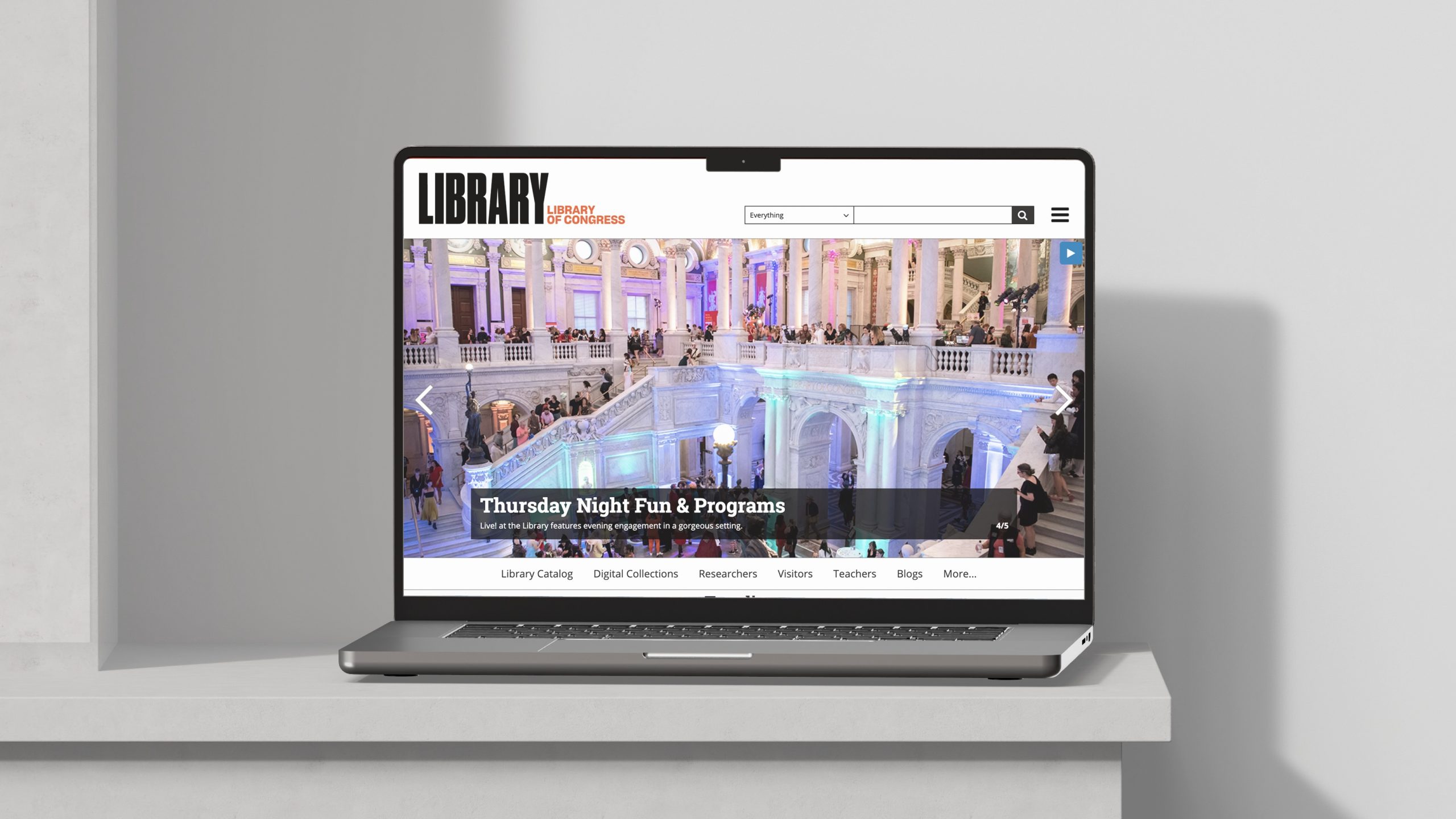
As co-facilitator of the Digital Front Door (DFD) working group, I helped lead a cross-functional effort to examine how users actually arrive at and navigate through LOC.gov. What began as a homepage redesign initiative quickly expanded into something more foundational: a strategic exploration of entry points, content priorities, and the overall architecture of public engagement on the Library’s primary web platform.
This post shares how I reframed the challenge, collaborated across disciplines, and developed a research-driven UX roadmap to support the Library’s evolving digital strategy.
Framing the Problem
The original intent of the Digital Front Door initiative was to examine and improve the LOC.gov homepage. But early in the process, I recognized that treating the homepage as the Library’s only “entry point” was an oversimplification.
Through metrics analysis and traffic pattern review, I recognized that users often bypass the homepage entirely. High-traffic pages included deep content areas—like the Prints & Photographs Online Catalog, legislative databases, blog posts, copyright registration portals, and curated exhibits. Each of these served as a functional “front door” for different audiences with different needs.
This insight shifted the group’s focus. Rather than centering exclusively on a single landing page, I began to ask broader questions:
- How do users arrive at LOC.gov?
- What are they trying to accomplish once they get there?
- How can we make these diverse entry points more coherent, accessible, and welcoming?
This reframing allowed the group to move from tactical redesign toward a strategic, ecosystem-wide approach—one that could better serve both occasional visitors and deep researchers, first-time users and repeat professionals.
Cross-Disciplinary Collaboration
To explore these questions with the nuance they deserved, I needed a range of perspectives. I co-facilitated the DFD working group, which brought together staff from across the Library—including UX designers, web architects, content strategists, communications leads, product owners, and research analysts.
From the outset, I treated this as a discovery-led initiative, not a design sprint. I prioritized listening, knowledge-sharing, and building shared understanding across disciplines.
To enrich our internal conversations, we invited guest speakers from peer institutions to present how they approached similar challenges. One particularly valuable session came from the National Park Service, whose work on digital access and interpretive content provided a compelling parallel to our own goals. Their insights helped us understand how others structure and maintain digital entry points across a sprawling, public-facing institution.
These collaborative sessions helped clarify both the scope and the stakes: users weren’t just finding LOC.gov through one canonical path—they were entering through dozens of specialized doorways, and we needed a strategy that could support all of them.
Building the Roadmap
As the group’s understanding of the problem matured, so did the need for a structured, intentional plan. I shaped and articulated a UX roadmap that would guide the working group’s discovery activities and align our efforts with broader Library initiatives.
Rather than jumping to interface design or homepage wireframes, I outlined a series of foundational questions:
- How do current entry points serve (or fail) different audiences?
- What governance models shape the current homepage and related landing pages?
- What internal processes support—or hinder—content curation and updates?
- What would a more intentional content strategy look like across entry points?
This roadmap helped focus the group’s time and attention on the highest-impact areas: navigation clarity, content prioritization, audience framing, and governance structures. It also allowed us to coordinate with other efforts underway at the Library, including design system work, IA modernization, and analytics planning.
The roadmap wasn’t just a timeline—it was a shared lens through which we could examine the challenges of LOC.gov at the platform level.
Stakeholder Engagement
To complement our internal exploration, I led a series of stakeholder interviews across the Library. These conversations helped me understand how different parts of the Library interact with LOC.gov—from those managing content and programs to those navigating editorial constraints or supporting end users.
I spoke with over two dozen individuals across departments, including Communications, Library Collections & Services, Visitor Engagement, Professional Learning & Outreach, and Exhibitions. Some were responsible for curating public-facing pages; others were navigating legacy systems, editorial constraints, or deeply siloed workflows.
Each interview followed a semi-structured format, but I made space for open-ended dialogue. What I heard confirmed some of our assumptions, but also surfaced hidden tensions—between centralized goals and decentralized ownership, between user needs and internal constraints, between short-term updates and long-term strategy.
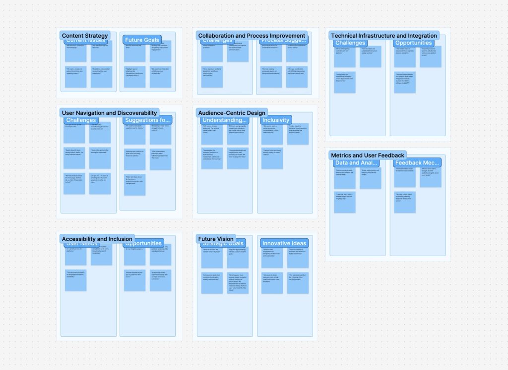
I synthesized the interview insights using affinity diagramming to surface recurring themes. These themes would go on to shape both our recommendations and the structure of the report I delivered later in the process.

Comparative Analysis
In parallel with stakeholder interviews, I oversaw a comparative analysis of peer institutions to better understand how other large, mission-driven organizations structure their digital front doors. The goal wasn’t to copy design patterns outright, but to identify strategic approaches to entry point design, audience segmentation, and content prioritization.
We examined a mix of cultural heritage, government, and research institutions—including the Smithsonian, National Archives (NARA), Europeana, the British Library, and others. For each site, we looked at:
- Homepage structure and editorial priorities
- Navigation models and how audiences are framed
- Language and calls to action (e.g., “Explore,” “Research,” “Visit”)
- Use of visuals, hero content, and featured collections
- Mobile responsiveness and accessibility practices
What emerged were patterns—both in strengths and missed opportunities—that helped contextualize LOC.gov within a broader digital landscape. Some sites emphasized immediacy and public relevance; others leaned into structured research pathways. Very few managed to do both well.
This landscape review became a key input in shaping our own recommendations, particularly around content strategy, visual hierarchy, and the role of audience framing in homepage design.
Synthesis & Recommendations
After weeks of discovery work, we synthesized our findings into a clear set of themes and strategic recommendations. I led the creation of two core deliverables: a formal report and a supporting slide deck. These artifacts were designed to communicate both the depth of our research and the urgency of the opportunities we uncovered.
Our synthesis highlighted six recurring themes:
- Navigation & Information Architecture – Users struggle to find content due to inconsistent navigation models and buried pathways.
- Content Strategy & Editorial Framing – Entry points lack intentional curation; homepage real estate doesn’t always reflect current priorities.
- Audience Awareness & Segmentation – Pages rarely acknowledge who they’re for — researchers, educators, the general public — making it harder for users to orient themselves.
- Governance & Ownership – Content updates are often delayed due to decentralized authority and unclear workflows.
- Search vs. Discovery – LOC.gov over-relies on search, missing opportunities to guide exploratory users or highlight timely content.
- Design System Alignment & Technical Constraints – While design standards are improving, constraints still shape what’s possible for key landing pages.
I presented our recommendations to the Product Governance Board, outlining immediate actions and long-term strategies. These included:
- Rethinking homepage content zones to support modular, editorial updates
- Aligning audience paths across multiple entry points
- Developing a more coordinated governance model for high-traffic pages
- Using data and user research to inform future iterations
The presentation helped secure leadership alignment and laid the groundwork for subsequent design and content strategy efforts across LOC.gov.
Reflection
This project was a reminder that great UX work often begins long before a wireframe is drawn. By starting with strategy—listening, analyzing, mapping, aligning—we created the conditions for better design to emerge later.
The Digital Front Door initiative wasn’t just about improving a homepage. It was about reframing how a national institution thinks about public access, audience needs, and the digital architecture that supports both. Our team helped shift the conversation from “what should the homepage look like?” to “how do we create meaningful, navigable entry points for the public?”
Personally, this work reinforced my belief in UX as a bridge—between disciplines, between strategy and execution, and between user needs and institutional goals. It also highlighted the power of structure: structured inquiry, structured collaboration, and ultimately, a structured pathway toward more intentional digital experiences.
