Category: TILT

  • The Emotional Weight of Low Battery

    The Emotional Weight of Low Battery

    Just a sliver of white, tucked into the top-right corner of the screen — and yet it triggers a cascade of reactions: anxiety, urgency, a scramble for a charger. On an iPhone, the low battery icon may be black and white, but the reaction it provokes is unmistakably red. It’s not just a sign of dwindling power; it’s a symbol of dwindling options.

    There’s even a name for that creeping dread: nomophobia — short for “no mobile phone phobia.” Coined in a 2008 UK study, it described how over half of mobile users felt anxiety when their device was lost, low on battery, or without service. It’s not just about missing a message — it’s about losing access to maps, payments, photos, even a sense of orientation in the world.

    As our devices have gotten smaller and more powerful, battery life has become one of the most emotionally charged metrics we manage daily — and the visual language used to communicate it wields surprising influence. That tiny battery icon isn’t neutral. It carries weight. And for me, it’s become an ever-present shadow.

    My iPhone 11 no longer holds a full-day charge with what I’d consider typical use. If I forget to plug it in before heading out, the worry sets in — especially in a city I still get turned around in. Whether it’s for driving directions, calendar reminders, or even boarding passes, my phone is the lifeline I don’t want to see drained.

    So I plan around it.

    I usually carry a small 10,000 mAh Anker battery when I leave the house — just enough to top off my phone if I’m out all day. These battery banks aren’t accessories anymore — they’re insurance against the anxiety that little icon provokes.

    But none of them give me meaningful insight into how much power is left. You get four tiny LEDs. If three are lit, does that mean 75%? 61%? Enough to stream music on a long walk and still run GPS on the drive home? No idea.

    Three portable battery packs placed on a blue cutting mat. From left to right: a gray BioLite charger with yellow LED indicators, a tall black Anker power bank with circular LED ring, and a compact black Anker battery with four blue LED lights.
    Three battery banks I rotate through, each with its own vague LED power indicators — enough to hint at charge, but not enough to instill confidence.

    Designers have choices. And those choices matter.

    A recent post on Core77 digs into the design of power indicators on flashlights. Sounds niche, but the stakes are real. One police officer described the stress of clearing a stairwell in a blackout—without knowing if his flashlight would last. While some models show vague bar levels or simple LEDs, a standout design from Jeep and Energizer displays real-time time remaining, based on brightness settings. That’s smart design—turning abstraction into action.

    Battery life, by design

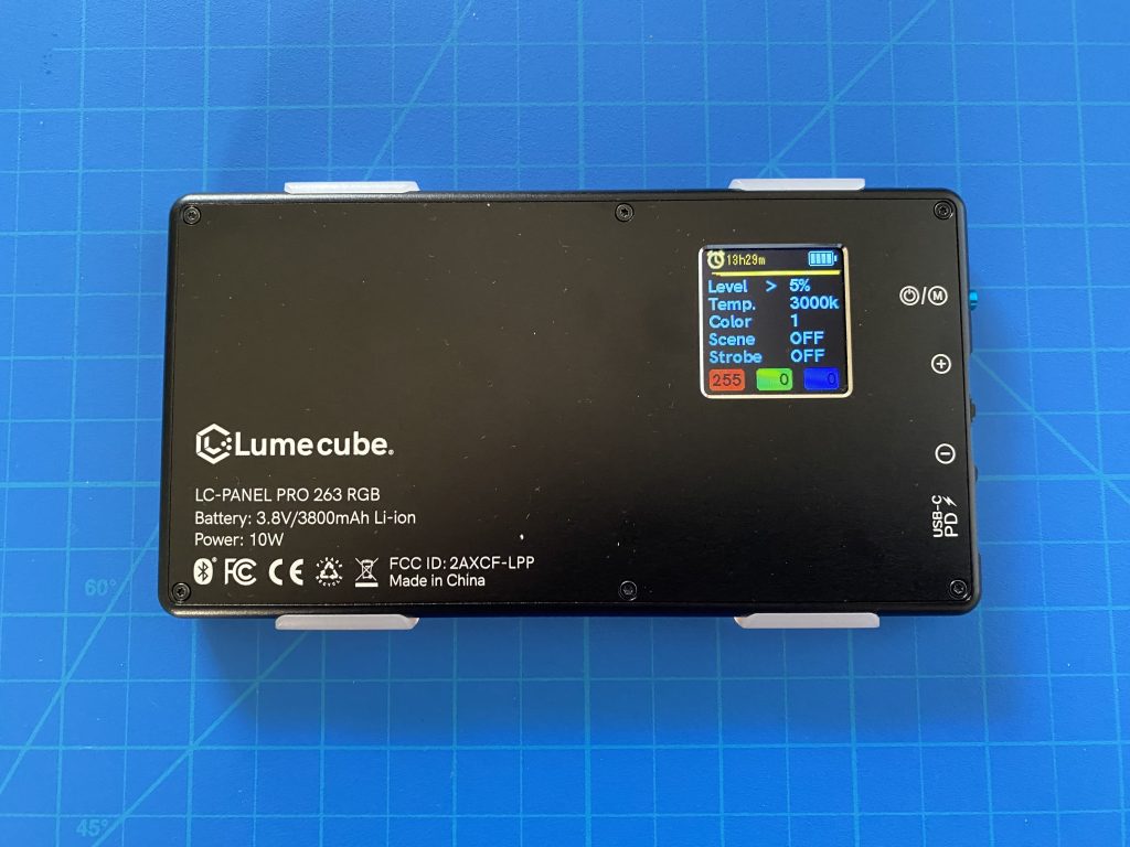
    My LumeCube — a compact LED lighting device — doesn’t just show battery percentage. It estimates hours and minutes remaining based on brightness, color temperature, and other settings. Change the brightness, and the estimate updates in real time.

    These aren’t just design details. They’re decisions that shape how we feel about using our tools. They help us gauge risk, plan our day, or—at the very least—quiet the anxiety that flickers to life with just a sliver of white in the corner of a screen.

    A LumeCube LC-Panel Pro LED light on a blue cutting mat, showing a detailed screen with battery life, time remaining (13h29m), brightness level (5%), color temperature (3000K), and other adjustable settings.
    Unlike battery banks, the LumeCube’s display provides contextual feedback—showing exactly how much time remains based on your selected brightness and settings. A model for thoughtful interface design.

    Links

    Nomophobiahttps://en.wikipedia.org/wiki/Nomophobia

    Examples of Good/Bad Execution of a UX Improvement for Flashlights (Core77) – https://www.core77.com/posts/138245/

    LumeCubehttps://lumecube.com/products/panel-pro

  • Seeing Color in a World Without End

    Seeing Color in a World Without End

    I recently had the chance to visit World Without End (https://caamuseum.org/exhibitions/2024/world-without-end-the-george-washington-carver-project) at the California African American Museum, an exhibition devoted to George Washington Carver’s legacy as both an artist and an innovator. The show reframed Carver not just as “the peanut guy” of popular imagination, but as a visionary who pioneered sustainable practices long before the term existed.

    One part of the exhibition that really caught my attention was Julie Beeler’s Mushroom Color Atlas (https://www.mushroomcoloratlas.com). This was my first time encountering the project, and it was captivating to see how many hues can be coaxed from something as humble as a mushroom—soft greens, earthy ochres, unexpected pinks and blues. In the gallery, her work was presented in dialogue with Carver’s own experiments in natural dyes, particularly those he created from peanuts and clay for use in weaving and painting.

    It was a striking curatorial choice. Carver, working in the early 20th century, was a tireless advocate for what we would now call sustainable design: rotating crops to restore soil health, producing natural fertilizers, and experimenting with plant-based materials that could serve as medicines, paints, textiles, or even construction components. He built the “Jesup Wagon,” a mobile classroom that carried tools, samples, and lessons out to farmers across the South. For Carver, design and science weren’t separate domains. They were part of a single mission to make life more equitable, resilient, and beautiful.

    World Without End places Carver’s paintings, sketches, and laboratory notebooks alongside the work of a couple dozen or so contemporary artists and collectives who continue to wrestle with the same questions: How do we live responsibly on this planet? How do we align craft, science, and art to create systems that endure? Seeing Beeler’s atlas in this context highlighted the continuity of these ideas. The careful process of extracting color from mushrooms isn’t just an aesthetic exercise—it’s an inquiry into materials, into overlooked natural resources, into the design of a more sustainable future.

    Leaving the museum, I kept thinking about color—not just the visual palette of mushrooms, peanuts, and clay, but the broader idea of design as something that must remain rooted in the living world. Carver’s world without end wasn’t about infinite extraction or consumption. It was about cycles, renewal, and design as stewardship.