Author: J. Bresner

  • Strategic Discovery for LOC.gov: Reframing the Digital Front Door

    Strategic Discovery for LOC.gov: Reframing the Digital Front Door

    Introduction

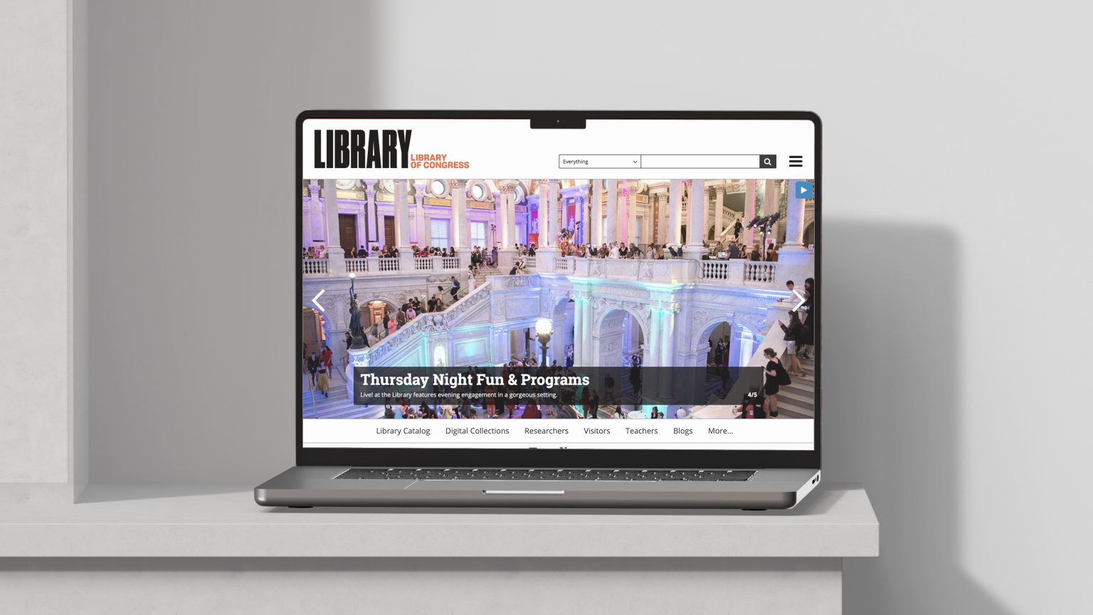
    In large institutions, homepages often carry symbolic weight—seen as the “front door” to everything an organization offers. But at the Library of Congress, we found that the real picture was far more complex.

    As co-facilitator of the Digital Front Door (DFD) working group, I helped lead a cross-functional effort to examine how users actually arrive at and navigate through LOC.gov. What began as a homepage redesign initiative quickly expanded into something more foundational: a strategic exploration of entry points, content priorities, and the overall architecture of public engagement on the Library’s primary web platform.

    This post shares how I reframed the challenge, collaborated across disciplines, and developed a research-driven UX roadmap to support the Library’s evolving digital strategy.

    Framing the Problem

    The original intent of the Digital Front Door initiative was to examine and improve the LOC.gov homepage. But early in the process, I recognized that treating the homepage as the Library’s only “entry point” was an oversimplification.

    Through metrics analysis and traffic pattern review, I recognized that users often bypass the homepage entirely. High-traffic pages included deep content areas—like the Prints & Photographs Online Catalog, legislative databases, blog posts, copyright registration portals, and curated exhibits. Each of these served as a functional “front door” for different audiences with different needs.

    This insight shifted the group’s focus. Rather than centering exclusively on a single landing page, I began to ask broader questions:

    • How do users arrive at LOC.gov?
    • What are they trying to accomplish once they get there?
    • How can we make these diverse entry points more coherent, accessible, and welcoming?

    This reframing allowed the group to move from tactical redesign toward a strategic, ecosystem-wide approach—one that could better serve both occasional visitors and deep researchers, first-time users and repeat professionals.

    Cross-Disciplinary Collaboration

    To explore these questions with the nuance they deserved, I needed a range of perspectives. I co-facilitated the DFD working group, which brought together staff from across the Library—including UX designers, web architects, content strategists, communications leads, product owners, and research analysts.

    From the outset, I treated this as a discovery-led initiative, not a design sprint. I prioritized listening, knowledge-sharing, and building shared understanding across disciplines.

    To enrich our internal conversations, we invited guest speakers from peer institutions to present how they approached similar challenges. One particularly valuable session came from the National Park Service, whose work on digital access and interpretive content provided a compelling parallel to our own goals. Their insights helped us understand how others structure and maintain digital entry points across a sprawling, public-facing institution.

    These collaborative sessions helped clarify both the scope and the stakes: users weren’t just finding LOC.gov through one canonical path—they were entering through dozens of specialized doorways, and we needed a strategy that could support all of them.

    Building the Roadmap

    As the group’s understanding of the problem matured, so did the need for a structured, intentional plan. I shaped and articulated a UX roadmap that would guide the working group’s discovery activities and align our efforts with broader Library initiatives.

    Rather than jumping to interface design or homepage wireframes, I outlined a series of foundational questions:

    • How do current entry points serve (or fail) different audiences?
    • What governance models shape the current homepage and related landing pages?
    • What internal processes support—or hinder—content curation and updates?
    • What would a more intentional content strategy look like across entry points?

    This roadmap helped focus the group’s time and attention on the highest-impact areas: navigation clarity, content prioritization, audience framing, and governance structures. It also allowed us to coordinate with other efforts underway at the Library, including design system work, IA modernization, and analytics planning.

    The roadmap wasn’t just a timeline—it was a shared lens through which we could examine the challenges of LOC.gov at the platform level.

    Stakeholder Engagement

    To complement our internal exploration, I led a series of stakeholder interviews across the Library. These conversations helped me understand how different parts of the Library interact with LOC.gov—from those managing content and programs to those navigating editorial constraints or supporting end users.

    I spoke with over two dozen individuals across departments, including Communications, Library Collections & Services, Visitor Engagement, Professional Learning & Outreach, and Exhibitions. Some were responsible for curating public-facing pages; others were navigating legacy systems, editorial constraints, or deeply siloed workflows.

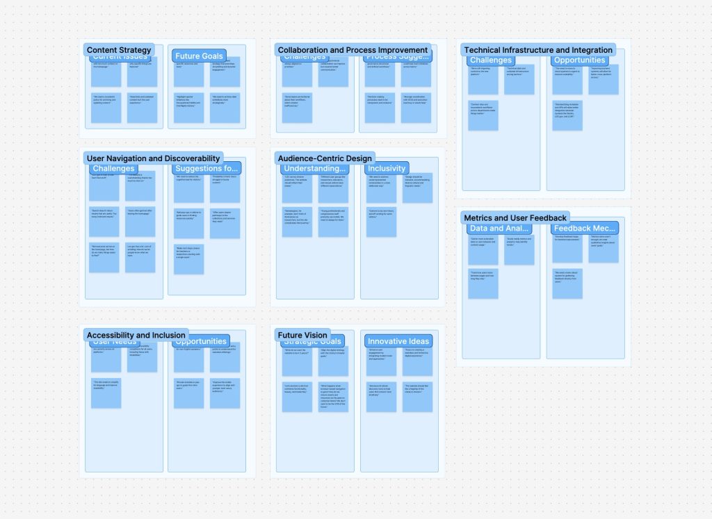
    Each interview followed a semi-structured format, but I made space for open-ended dialogue. What I heard confirmed some of our assumptions, but also surfaced hidden tensions—between centralized goals and decentralized ownership, between user needs and internal constraints, between short-term updates and long-term strategy.

    I synthesized the interview insights using affinity diagramming to surface recurring themes. These themes would go on to shape both our recommendations and the structure of the report I delivered later in the process.

    A digital whiteboard showing categorized sticky notes grouped under themes like “Content Strategy,” “Collaboration and Process Improvement,” “User Navigation and Discoverability,” “Accessibility and Inclusion,” and more. Each column has labeled sub-sections such as “Challenges,” “Opportunities,” and “Suggestions,” visually organizing stakeholder input.
    Thematic Affinity Map used to synthesize stakeholder feedback into key categories like content strategy, accessibility, and future goals—helping surface patterns, challenges, and opportunities across the initiative.

    Comparative Analysis

    In parallel with stakeholder interviews, I oversaw a comparative analysis of peer institutions to better understand how other large, mission-driven organizations structure their digital front doors. The goal wasn’t to copy design patterns outright, but to identify strategic approaches to entry point design, audience segmentation, and content prioritization.

    We examined a mix of cultural heritage, government, and research institutions—including the Smithsonian, National Archives (NARA), Europeana, the British Library, and others. For each site, we looked at:

    • Homepage structure and editorial priorities
    • Navigation models and how audiences are framed
    • Language and calls to action (e.g., “Explore,” “Research,” “Visit”)
    • Use of visuals, hero content, and featured collections
    • Mobile responsiveness and accessibility practices

    What emerged were patterns—both in strengths and missed opportunities—that helped contextualize LOC.gov within a broader digital landscape. Some sites emphasized immediacy and public relevance; others leaned into structured research pathways. Very few managed to do both well.

    This landscape review became a key input in shaping our own recommendations, particularly around content strategy, visual hierarchy, and the role of audience framing in homepage design.

    Synthesis & Recommendations

    After weeks of discovery work, we synthesized our findings into a clear set of themes and strategic recommendations. I led the creation of two core deliverables: a formal report and a supporting slide deck. These artifacts were designed to communicate both the depth of our research and the urgency of the opportunities we uncovered.

    Our synthesis highlighted six recurring themes:

    1. Navigation & Information Architecture – Users struggle to find content due to inconsistent navigation models and buried pathways.
    2. Content Strategy & Editorial Framing – Entry points lack intentional curation; homepage real estate doesn’t always reflect current priorities.
    3. Audience Awareness & Segmentation – Pages rarely acknowledge who they’re for — researchers, educators, the general public — making it harder for users to orient themselves.
    4. Governance & Ownership – Content updates are often delayed due to decentralized authority and unclear workflows.
    5. Search vs. Discovery – LOC.gov over-relies on search, missing opportunities to guide exploratory users or highlight timely content.
    6. Design System Alignment & Technical Constraints – While design standards are improving, constraints still shape what’s possible for key landing pages.

    I presented our recommendations to the Product Governance Board, outlining immediate actions and long-term strategies. These included:

    • Rethinking homepage content zones to support modular, editorial updates
    • Aligning audience paths across multiple entry points
    • Developing a more coordinated governance model for high-traffic pages
    • Using data and user research to inform future iterations

    The presentation helped secure leadership alignment and laid the groundwork for subsequent design and content strategy efforts across LOC.gov.

    Reflection

    This project was a reminder that great UX work often begins long before a wireframe is drawn. By starting with strategy—listening, analyzing, mapping, aligning—we created the conditions for better design to emerge later.

    The Digital Front Door initiative wasn’t just about improving a homepage. It was about reframing how a national institution thinks about public access, audience needs, and the digital architecture that supports both. Our team helped shift the conversation from “what should the homepage look like?” to “how do we create meaningful, navigable entry points for the public?”

    Personally, this work reinforced my belief in UX as a bridge—between disciplines, between strategy and execution, and between user needs and institutional goals. It also highlighted the power of structure: structured inquiry, structured collaboration, and ultimately, a structured pathway toward more intentional digital experiences.

  • The Emotional Weight of Low Battery

    The Emotional Weight of Low Battery

    Just a sliver of white, tucked into the top-right corner of the screen — and yet it triggers a cascade of reactions: anxiety, urgency, a scramble for a charger. On an iPhone, the low battery icon may be black and white, but the reaction it provokes is unmistakably red. It’s not just a sign of dwindling power; it’s a symbol of dwindling options.

    There’s even a name for that creeping dread: nomophobia — short for “no mobile phone phobia.” Coined in a 2008 UK study, it described how over half of mobile users felt anxiety when their device was lost, low on battery, or without service. It’s not just about missing a message — it’s about losing access to maps, payments, photos, even a sense of orientation in the world.

    As our devices have gotten smaller and more powerful, battery life has become one of the most emotionally charged metrics we manage daily — and the visual language used to communicate it wields surprising influence. That tiny battery icon isn’t neutral. It carries weight. And for me, it’s become an ever-present shadow.

    My iPhone 11 no longer holds a full-day charge with what I’d consider typical use. If I forget to plug it in before heading out, the worry sets in — especially in a city I still get turned around in. Whether it’s for driving directions, calendar reminders, or even boarding passes, my phone is the lifeline I don’t want to see drained.

    So I plan around it.

    I usually carry a small 10,000 mAh Anker battery when I leave the house — just enough to top off my phone if I’m out all day. These battery banks aren’t accessories anymore — they’re insurance against the anxiety that little icon provokes.

    But none of them give me meaningful insight into how much power is left. You get four tiny LEDs. If three are lit, does that mean 75%? 61%? Enough to stream music on a long walk and still run GPS on the drive home? No idea.

    Three portable battery packs placed on a blue cutting mat. From left to right: a gray BioLite charger with yellow LED indicators, a tall black Anker power bank with circular LED ring, and a compact black Anker battery with four blue LED lights.
    Three battery banks I rotate through, each with its own vague LED power indicators — enough to hint at charge, but not enough to instill confidence.

    Designers have choices. And those choices matter.

    A recent post on Core77 digs into the design of power indicators on flashlights. Sounds niche, but the stakes are real. One police officer described the stress of clearing a stairwell in a blackout—without knowing if his flashlight would last. While some models show vague bar levels or simple LEDs, a standout design from Jeep and Energizer displays real-time time remaining, based on brightness settings. That’s smart design—turning abstraction into action.

    Battery life, by design

    My LumeCube — a compact LED lighting device — doesn’t just show battery percentage. It estimates hours and minutes remaining based on brightness, color temperature, and other settings. Change the brightness, and the estimate updates in real time.

    These aren’t just design details. They’re decisions that shape how we feel about using our tools. They help us gauge risk, plan our day, or—at the very least—quiet the anxiety that flickers to life with just a sliver of white in the corner of a screen.

    A LumeCube LC-Panel Pro LED light on a blue cutting mat, showing a detailed screen with battery life, time remaining (13h29m), brightness level (5%), color temperature (3000K), and other adjustable settings.
    Unlike battery banks, the LumeCube’s display provides contextual feedback—showing exactly how much time remains based on your selected brightness and settings. A model for thoughtful interface design.

    Links

    Nomophobiahttps://en.wikipedia.org/wiki/Nomophobia

    Examples of Good/Bad Execution of a UX Improvement for Flashlights (Core77) – https://www.core77.com/posts/138245/

    LumeCubehttps://lumecube.com/products/panel-pro

  • Seeing Color in a World Without End

    Seeing Color in a World Without End

    I recently had the chance to visit World Without End (https://caamuseum.org/exhibitions/2024/world-without-end-the-george-washington-carver-project) at the California African American Museum, an exhibition devoted to George Washington Carver’s legacy as both an artist and an innovator. The show reframed Carver not just as “the peanut guy” of popular imagination, but as a visionary who pioneered sustainable practices long before the term existed.

    One part of the exhibition that really caught my attention was Julie Beeler’s Mushroom Color Atlas (https://www.mushroomcoloratlas.com). This was my first time encountering the project, and it was captivating to see how many hues can be coaxed from something as humble as a mushroom—soft greens, earthy ochres, unexpected pinks and blues. In the gallery, her work was presented in dialogue with Carver’s own experiments in natural dyes, particularly those he created from peanuts and clay for use in weaving and painting.

    It was a striking curatorial choice. Carver, working in the early 20th century, was a tireless advocate for what we would now call sustainable design: rotating crops to restore soil health, producing natural fertilizers, and experimenting with plant-based materials that could serve as medicines, paints, textiles, or even construction components. He built the “Jesup Wagon,” a mobile classroom that carried tools, samples, and lessons out to farmers across the South. For Carver, design and science weren’t separate domains. They were part of a single mission to make life more equitable, resilient, and beautiful.

    World Without End places Carver’s paintings, sketches, and laboratory notebooks alongside the work of a couple dozen or so contemporary artists and collectives who continue to wrestle with the same questions: How do we live responsibly on this planet? How do we align craft, science, and art to create systems that endure? Seeing Beeler’s atlas in this context highlighted the continuity of these ideas. The careful process of extracting color from mushrooms isn’t just an aesthetic exercise—it’s an inquiry into materials, into overlooked natural resources, into the design of a more sustainable future.

    Leaving the museum, I kept thinking about color—not just the visual palette of mushrooms, peanuts, and clay, but the broader idea of design as something that must remain rooted in the living world. Carver’s world without end wasn’t about infinite extraction or consumption. It was about cycles, renewal, and design as stewardship.

  • Liberty Trail: Interpretive Signage for Historic Battlefields

    Liberty Trail: Interpretive Signage for Historic Battlefields

    Project Overview

    The Liberty Trail—a collaboration between the American Battlefield Trust and the South Carolina Battleground Trust—connects Revolutionary War battlefields across South Carolina and tells the captivating, often overlooked stories of this transformative chapter in American history.

    As part of this initiative, I was commissioned to design 50 interpretive signs for 10 historic sites, helping to engage visitors with accessible, visually compelling narratives. My role was to translate dense historical content into clear, legible signage layouts tailored for outdoor public spaces.

    Design Impact

    Working closely with the American Battlefield Trust, I created the final design for a revised interpretive signage template that leveraged rich photography, historical maps, and archival illustrations. The layout featured hero imagery spanning the full 36-inch width of each panel while reserving space for supporting visuals and callout quotes to deepen the narrative.

    Each design was delivered as production-ready artwork, complete with printer marks and fabrication specifications. The system ensured visual consistency across locations while allowing for site-specific storytelling. The completed signs are now installed across the state, enhancing public understanding of South Carolina’s role in the American Revolution.

    Style Guide Development

    To help ensure consistency across signage in future phases of the Liberty Trail project, I drafted initial pages of a style guide — including layout specifications, typography choices, and tone of voice recommendations. These materials could serve as the foundation for a scalable signage system.

    Site Spotlight: Fort Fair Lawn

    The video below, produced by Fox News, highlights Fort Fair Lawn—one of several key sites featured along the Liberty Trail. This segment underscores the importance of preserving and interpreting Revolutionary War history, and offers real-world context for the signage I designed for this location.

    Interpretive Signage Designs

    Below are a selection of the final panels developed for the Battle of Camden, Marion Square, Fort Fair Lawn, and Hanging Rock. These examples include printer marks as part of the final press-ready files. Each sign was carefully composed to transform in-depth historical research into clear, engaging content that supports on-site learning, reflection, and exploration.

  • Why You Really Need Solar Eclipse Glasses

    Why You Really Need Solar Eclipse Glasses

    On April 8, 2024, a total solar eclipse will pass over parts of Mexico, the United States, and Canada. Like many people, I went online to buy eclipse glasses and immediately stumbled into a maze of warnings: some products were fake, some were unsafe, and I wondered how I’d know the difference. The American Astronomical Society maintains a list of verified suppliers, but the bigger question kept nagging me: what actually happens if you stare at the sun?

    I grew up hearing “you’ll go blind” if you do it, but I never really understood what that meant physiologically. So I dug in.

    The Safety Standard

    Most reputable solar eclipse glasses are marked with ISO 12312-2, an international safety standard for direct solar viewing. To pass, the filters must block more than 99.997% of visible light, as well as nearly all UVA and infrared. That’s why putting on a proper pair feels like wearing a welding mask—you see only a faint orange dot where the sun is.

    The filters themselves are usually made from a polymer infused with carbon black and backed with a thin layer of metal, often aluminum. The carbon absorbs light, the metal reflects some away, and what gets through is such a tiny fraction that it’s safe for your eyes.

    What Happens Without Protection

    Without eclipse glasses, the story is very different. The sun’s light concentrates on the macula, the part of the retina packed with cone cells. The macula’s yellow pigment naturally absorbs a lot of high-energy blue and UV light. Normally, your eyes handle everyday light just fine, but staring directly at the sun floods the system.

    At the molecular level, light drives a chemical cycle that lets us see: Vitamin A derivatives in the retina change shape when struck by photons and then reset in a continuous loop. But under intense light, that loop gets overloaded. Instead of resetting cleanly, the molecules produce an excess of free radicals. In small amounts, free radicals are part of normal metabolism, but in high concentrations they damage lipids, proteins, and cell membranes. This oxidative stress is what scars retinal cells—sometimes temporarily, sometimes permanently.

    Contrary to the term “retinal burn,” the injury isn’t usually about heat. Infrared light can warm the eye slightly, but the real danger is chemical damage from too much light energy.

    Final Thoughts

    • Quick glances at the sun won’t blind you, but they can still affect your vision.
    • Sunglasses won’t help—they don’t filter nearly enough.
    • ISO-certified eclipse glasses are the only safe way to watch an eclipse directly.

    So if you’re planning to watch the eclipse, don’t risk your vision. Get certified glasses, check the markings, and enjoy the view safely.

    References

  • How I Set Up a FlightRadar24 Tracker at Home

    How I Set Up a FlightRadar24 Tracker at Home

    As someone who flies often, I’ve come to rely on FlightRadar24 for a bit of peace of mind—checking airport traffic, tracking incoming flights, or just confirming that yes, the plane I’m waiting on really hasn’t left yet. So when I learned that FlightRadar24 lets you contribute live aircraft tracking data from your own home, I was intrigued.

    I assumed it’d be complicated. It wasn’t. I set it up in under an hour, and now I get a Business-level subscription (normally $500/year) for free—plus a live stats dashboard of all the aircraft my antenna picks up.

    Here’s how it works—and how you can set up your own.

    What You Need

    The core of the setup is just a Raspberry Pi connected to an ADS-B antenna. Here’s what I used:

    • Raspberry Pi (Model 3B+ in my case, though newer models work too)
    • ADS-B USB receiver (the kind tuned to 1090 MHz)
    • Stock antenna that came with the USB dongle
    • MicroSD card (at least 8GB)
    • Power supply for the Pi
    • Optional: a case for the Pi and a better antenna placement (e.g., near a window)

    No soldering. No weird configuration files. It’s basically plug-and-play.

    The Setup Process

    1. Download the Pi24 Image
      Head to flightradar24.com/share-your-data and download the Pi24 image—a prebuilt Raspberry Pi operating system that includes all the FlightRadar24 feeder software.
    2. Flash the Image to a microSD Card
      Use Etcher (or Raspberry Pi Imager) to write the image to your SD card:
      • Open Etcher
      • Click “Flash from file” and select the Pi24 image you downloaded
      • Click “Select target” and choose your SD card
      • Click “Flash” and wait for it to finish
      • Eject the card once complete
    3. (Optional) Set Up Wi-Fi
      If you’re not using Ethernet, you can set up Wi-Fi before inserting the card:
      • Reinsert the SD card into your computer
      • Find a file called wpa_supplicant.conf.template
      • Rename it to wpa_supplicant.conf
      • Open it and enter your Wi-Fi network name and password in the quotes
      • Save the file and eject the card
    4. (Optional) Restore an Existing Radar ID
      If you’ve previously hosted a feeder and want to reclaim your radar ID:
      • Find the file fr24key.txt on the SD card
      • Paste your existing sharing key as plain text into the file and save it
      • This lets FlightRadar24 recognize your setup automatically
    5. Assemble and Power Up
      Insert the microSD card into your Pi. Plug in the ADS-B USB dongle and antenna. Then connect power (and optionally Ethernet if you’re not using Wi-Fi).
    6. Register the Receiver
      On a device connected to the same network, visit flightradar24.com/share-your-data. The system will detect your Pi24 feeder and guide you through registering it.
    7. Start Feeding and Get Access
      Once your feeder is active, you’ll receive an email from FlightRadar24 with instructions on how to access your free Business subscription, as well as your personal dashboard showing coverage stats, system health, and more.

    What You See

    Once your tracker is online, you get access to:

    • A personal dashboard showing how many aircraft you’re tracking, where they’re headed, and how far away they are
    • System health stats for your feed
    • Your coverage map—showing how far your antenna can “see”
    • Full access to the FlightRadar24 Business tier, including historical flight playback, weather overlays, and more

    Notes & Tips

    • Antenna placement matters – Height and clear line-of-sight to the sky are more important than antenna type.
    • Don’t worry about orientation – The stock antenna is omnidirectional, so you don’t need to angle or point it. Just get it up high and away from thick walls or metal objects.
    • Expect a warm-up period – You won’t see a flood of planes right away. Give it 10–15 minutes after powering on for the feeder to start showing data.
    • Bookmark your local stats page – Once your Pi is up and running, you can visit its IP address on your network to view real-time stats at http:/<your-Pi-IP>:8754. You’ll see aircraft count, range graphs, and system health.
    • Feeder name = your radar ID – Once registered, your feeder gets a name like T-XXXX123. You can use this to check status from anywhere at feed.flightradar24.com.
    • Stable power = stable feed – A reliable power supply is important. Sudden shutdowns can corrupt the SD card. If you want to run it 24/7, consider a small UPS or surge-protected outlet.
    • You can feed other networks too – FlightAware, ADS-B Exchange, and others allow dual-feeding from the same Pi. Some even give perks (like stats dashboards or premium accounts).

    Why It’s Worth It

    This isn’t just a hobby project. It’s a tiny piece of real-time infrastructure. Each tracker helps build a more accurate map of our skies. And it’s one of the rare tech setups where:

    • You learn something
    • You contribute to something
    • You get rewarded with a full-featured account

    Not bad for an afternoon project.

    Screenshot of the FlightRadar24 app showing a Japan Airlines flight (JAL062) from Tokyo (NRT) arriving at Los Angeles International Airport (LAX). The flight is a Boeing 787-9 Dreamliner at 1,201 feet altitude and traveling at 150 knots. The map displays multiple aircraft icons over the Los Angeles area, with the selected flight approaching from over Santa Monica Bay.
  • Digitizing the Tangible at the Library of Congress

    Digitizing the Tangible at the Library of Congress

    When I joined the Library of Congress 3D Digital Modeling, Imaging, and Printing Working Group in 2019, I had no idea I’d soon be photographing a bronze cast of Abraham Lincoln’s right hand. The original cast, created by sculptor Leonard Wells Volk in 1860, shows Lincoln’s hand gripping a sawed-off broomstick—a detail added at the sculptor’s suggestion to stabilize Lincoln’s hand during the sitting. That same cast became one of the Library’s first publicly released 3D models.

    The 3D Working Group was formed to explore how new imaging technologies might make select physical objects from the Library’s vast collections accessible online as interactive models and downloadable 3D prints. I joined as a UX designer and subject matter expert to help evaluate tools and guide artifact selection. Reviewing an early list of proposed items, I flagged potential scanning challenges—including objects that were highly reflective, transparent, or visually flat (like campaign buttons), which would not render well via photogrammetry or result in compelling 3D prints.

    Together, our cross-functional group included representatives from Conservation, the Digital Scan Center, Learning and Innovation, Labs, Digital Strategy, Rare Books, and Design & Development. Over a dozen LOC staff were trained in photogrammetry by Cultural Heritage Imaging, earning certification in “Photogrammetry for Scientific Documentation.” In just a few days, we created and published two models: the cast of Lincoln’s hand and a medieval manuscript (the Exposicio mistica).

    The project marked the first time the Library shared 3D models on labs.loc.gov and on Sketchfab, using the Smithsonian’s open-source Voyager viewer. I printed both models at home using my personal 3D printer—and seeing Lincoln’s hand emerge layer by layer in resin was a surreal moment.

    The models were shared freely, along with downloadable STL files for educators, students, researchers, and curious minds. Use cases ranged from classroom engagement to preservation modeling. But the pilot had limits. One major challenge was the collection itself: many Library artifacts—flat works on paper, books, audio reels—don’t translate easily to 3D modeling. The narrow pool of viable items meant our pilot was always a bit constrained, and without a sustainable pipeline of future artifacts, the project lost momentum after its initial release.

    Even so, the LOC 3D pilot was a pivotal experience. It shaped how I think about prototyping, metadata, and the messy translation between physical and digital forms.

  • Expanding Access, One Business Card at a Time

    Expanding Access, One Business Card at a Time

    A few months ago, I had an idea for the Library of Congress (where I work)—what if our business cards could do more than share our contact info? What if they could reflect the mission of the Library itself?

    As part of the Library’s strategic goals, we often talk about “expanding access.” That means making collections, experts, and services available where, when, and how users need them. Whether that’s through digitization, exhibitions, educational outreach, or something as small as a business card—it’s about meeting people where they are.

    Around the same time, the Library’s Development Office was actively fundraising for upcoming exhibitions. I started thinking: what if we could leave something tangible behind when speaking with potential donors? A tiny, meaningful reminder of what we were trying to share.

    So I sketched out a simple idea: keep the standard Library business card on the front, but on the back, feature an image from the collection—a primary source, a striking photo, a beautiful map—and pair it with a short URL or QR code that links directly to the item online.

    It becomes a conversation starter, a prompt, a bridge between the physical and digital collection. For Development staff, it could support specific fundraising efforts. For everyone else, it offered a way to personalize their cards with an item that resonated—whether related to their work or simply something they loved from the collections.

    I mocked up a few designs and tested the layout with different images. The result feels simple and human—a practical way to bring collection items into everyday conversation.

    It becomes a pocket-sized reflection of the Library’s purpose, quietly reinforcing what connects us all—access to knowledge.